We build websites for small businesses in Stockholm, an Irish pub among them. This is what we think about when we make a site for a restaurant or a pub, roughly in the order guests look for things.
The essentials, at the top
Plenty of people open a restaurant’s website on their phone, often on the way somewhere. The essentials should be right there, without scrolling or digging through a menu:
- The address, ideally with the area or the nearest metro station.
- Today’s opening hours, and the kitchen’s on their own if it closes before the bar.
- The phone number, as a link you tap to call.
- A button to book a table.
It sounds obvious, and yet it easily ends up at the bottom of the footer. Put it at the top, and make sure the hours match what Google shows. When two places say different things, guests don’t know which one to believe.
Booking that works on a phone
If you use a booking system, put the booking on the page or link to it with a clear button, not a small text link at the bottom. Try booking on your own phone. How many steps is it, and do you have to zoom?
Think about the people who can’t, or won’t, book online too:
- Big groups: say how many you take online and what to do if there are more.
- Walk-ins: do you take guests without a booking? Say so, or people may assume you don’t.
- Questions: a short contact form or an email address for anything that doesn’t fit a booking.
The menu: text or PDF?
A choice worth thinking through, because both have upsides and downsides.
A menu as text on the page is the easiest to read on a phone, can be searched, and Google can read what it says. Prices and allergens are clear. The downside: someone has to be able to change it, which means the site needs a simple way to do that.
A menu as a PDF is quick to swap: whoever writes the menu already has the file, and it just gets uploaded. The downside is that a PDF is awkward to read on a small screen and can be heavy to load.
At The Auld Dub, the pub we built the website for, the admin panel has a PDF menu upload. That makes changing it easy without asking anyone for help, but a PDF menu has the same drawbacks on a phone there as anywhere else.
A good middle ground: the main dishes and the allergens as text on the page, and the full menu as a PDF for anyone who wants every line. Or a menu staff edit right on the page, if it changes often.
Map and directions
A map on the page, and a link that opens directions in the phone’s map app. If you’re in a courtyard, down a flight of stairs or somewhere easy to walk past, say so in one sentence. “Entrance from the street, one floor down” saves a phone call.
Real photos
Guests want to see what your place is like: the room, the food, the bar, people having a good time. A stock photo of a plate of pasta tells them nothing about you. The photos don’t have to be taken by a pro, but they should be sharp, well lit and true to how it is. Replace them when the room or the menu changes.
They should also be compressed (made smaller as files), or the page gets slow. Which brings us to the next point.
Fast on a phone
A restaurant site is often slow for the same reasons: big photos at full size, a video that starts on load and several embedded social media feeds. It shows most on a phone with a weak connection, which is exactly when a guest is standing in the street deciding where to go.
- Images sized for the screen, in modern formats like WebP or AVIF.
- No heavy video that has to load before anything shows.
- Test the site on your own phone, on mobile data, not only on a computer.
Your Google Business Profile
When someone searches for your name, Google often shows your Business Profile, with a map, hours, photos and reviews, before they’ve even clicked through to your website. The profile and the site should agree:
- The same opening hours in both places, holiday hours included.
- A link to your website, and ideally straight to the menu and booking.
- The right category, such as restaurant or pub.
- Your own, up-to-date photos.
You manage the profile yourself at Google, but the website should say the same thing. We don’t promise rankings in Google, for the profile or for the site. What we do is build the site so Google can read it.
What a pub needs on top
A pub isn’t just a restaurant with beer. Guests ask about different things, and those answers belong on the site.
Which matches are you showing?
A sports pub gets the same question all the time: are you showing the game? The answer should be on the website, as a list of upcoming matches with dates and times that staff add themselves. If people have to ring the bar to find out, it’s easy for them to go somewhere else.
Live music and events
Gigs, pub quizzes, theme nights: a calendar staff update without help. What matters is that past events drop off on their own, so the site never shows last month’s line-up. And that there is one schedule, in one place.
Groups and private parties
Work parties, birthdays, stag dos, a group that wants to watch the final together. Say what you offer: how many you take, whether part of the room can be booked, whether there’s a set menu and how to ask. A simple form with the date, the number of people and what it’s for gets you everything you need in the first message.
Menus that change
The weekly special, a match-day menu, the season’s dishes. If the menu changes often it has to be easy to swap, or it goes stale. That is why The Auld Dub’s admin panel has a menu upload.
Guests who don’t speak Swedish
A pub in Stockholm often has guests who don’t speak Swedish: tourists, people who moved here for work, fans on their way to a game. A site in both Swedish and English helps them find what they need and understand the rules. The text should be written in both languages, not machine translated, and switching should be easy.
An example: The Auld Dub
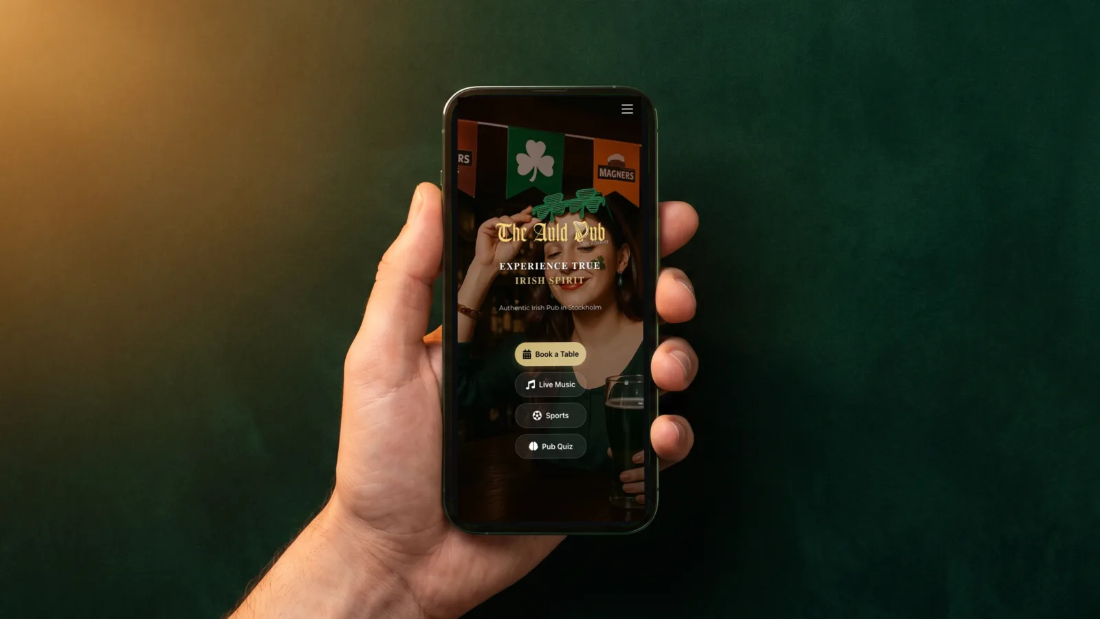
The Auld Dub is an Irish pub in Stockholm with food, drinks, live music and sports on TV. What was built for it:
- the website, with a map to the pub
- an admin panel where matches and live-music events are added
- PDF menu upload
- a contact form and SEO basics
On a phone, the start screen goes straight to what guests come for: book a table, live music, sports and the pub quiz. See it live at theaulddub.se, or read more on the project page.
A template or a built site?
For a small restaurant with a fixed menu and fixed hours, a template from a site builder is often enough. It’s quick, and you can do it yourself.
A built site is worth it when the site has to do more than show information:
- staff should be able to add matches, events or menus themselves, easily
- the site needs to be in two languages
- booking, group enquiries and contact need to work together
- it should look like your place, not like everyone else’s
If you get lots of questions by DM and email, an AI assistant can answer the common ones. How that works, and what it can’t do, is in AI chatbots for business.
Checklist
- Address, today’s hours and phone number at the top
- The phone number can be tapped
- A booking button that is easy to see and works on a phone
- The menu as text, or at least the main dishes and allergens
- A map and one sentence on how to find the door
- Your own photos, at the right size
- Loads fast on a phone
- The same hours as on Google
- For a pub: matches, events and groups, updated by staff
- Swedish and English, if many guests don’t speak Swedish
If you’d like help with your site, there’s more on how we build websites.